getwd()[1] "C:/Users/0131045s/Desktop/Programming/R/Workshops/rintro/activities/week9"In this weeks workshop, we are going to learn how to generate APA style plots in R. In particular, we are going to learn about the ggplot2 package and it’s associated function ggplot(). This package has been used to create plots for publications like the BBC and the Economist. By the end of this session you should be capable of:
Let’s begin by ensuring your working environment is ready for today’s session. Open RStudio or Posit Cloud and complete the following tasks to set everything up.
One of the first steps in each of these workshops is setting up your *working directory*. The working directory is the default folder where R will look to import files or save any files you export.
If you don’t set the working directory, R might not be able to locate the files you need (e.g., when importing a dataset) or you might not know where your exported files have been saved. Setting the working directory beforehand ensures that everything is in the right place and avoids these issues.
Click:
Session → Set Working Directory → Choose Directory
Navigate to the folder you created for this course (this should be the same folder you used for previous workshops).
Create a new folder called week9 inside this directory.
Select the week9 folder and click Open.
Don’t forget to verify your working directory before we get started
You can always check your current working directory by typing in the following command in the console:
getwd()[1] "C:/Users/0131045s/Desktop/Programming/R/Workshops/rintro/activities/week9"As in previous weeks we will create an R script that we can use for today’s activities. This week we can call our script 09-datavis
Go to the menu bar and select:
File → New File → R Script
This will open an untitled R script.
To save and name your script, select:
File→ Save As, then enter the name:
09-datavis
Click Save
We’ll be using several R packages to make our analysis easier.
REMEMBER: If you encounter an error message like “Error in library(package name): there is no packaged calledpackage name”, you’ll need to install the package first by editing the following for your console:
install.packages("package name") #replace "package name" with the actual package nameHere are the packages we will be using today:
library(tidyverse)Warning: package 'tidyverse' was built under R version 4.3.3Warning: package 'ggplot2' was built under R version 4.3.3Warning: package 'tibble' was built under R version 4.3.2Warning: package 'tidyr' was built under R version 4.3.2Warning: package 'readr' was built under R version 4.3.2Warning: package 'purrr' was built under R version 4.3.2Warning: package 'dplyr' was built under R version 4.3.2Warning: package 'stringr' was built under R version 4.3.2Warning: package 'forcats' was built under R version 4.3.2Warning: package 'lubridate' was built under R version 4.3.2── Attaching core tidyverse packages ──────────────────────── tidyverse 2.0.0 ──
✔ dplyr 1.1.4 ✔ readr 2.1.4
✔ forcats 1.0.0 ✔ stringr 1.5.1
✔ ggplot2 3.5.1 ✔ tibble 3.2.1
✔ lubridate 1.9.3 ✔ tidyr 1.3.0
✔ purrr 1.0.2
── Conflicts ────────────────────────────────────────── tidyverse_conflicts() ──
✖ dplyr::filter() masks stats::filter()
✖ dplyr::lag() masks stats::lag()
ℹ Use the conflicted package (<http://conflicted.r-lib.org/>) to force all conflicts to become errorslibrary(ggplot2)
library(knitr)Warning: package 'knitr' was built under R version 4.3.2library(patchwork)Warning: package 'patchwork' was built under R version 4.3.3library(jtools)Warning: package 'jtools' was built under R version 4.3.3This week we will use a database of personality variables to practice making graphs.
- personality.csv
week9 folder.Once this is done load the dataset into R and save it as a dataframes called “df_personality”:
df_personality <- read.csv("personality.csv")In our first session, we analysed the sleep data frame. This involved creating and exporting a plot using the `base R` `plot()` function. The code looked like this:
plot(sleep$group, sleep$extra,
     xlab = "Treatment Group",
     ylab = "Number of Extra Hours of Sleep",
     main = "Effect of Treament on Sleep Duration")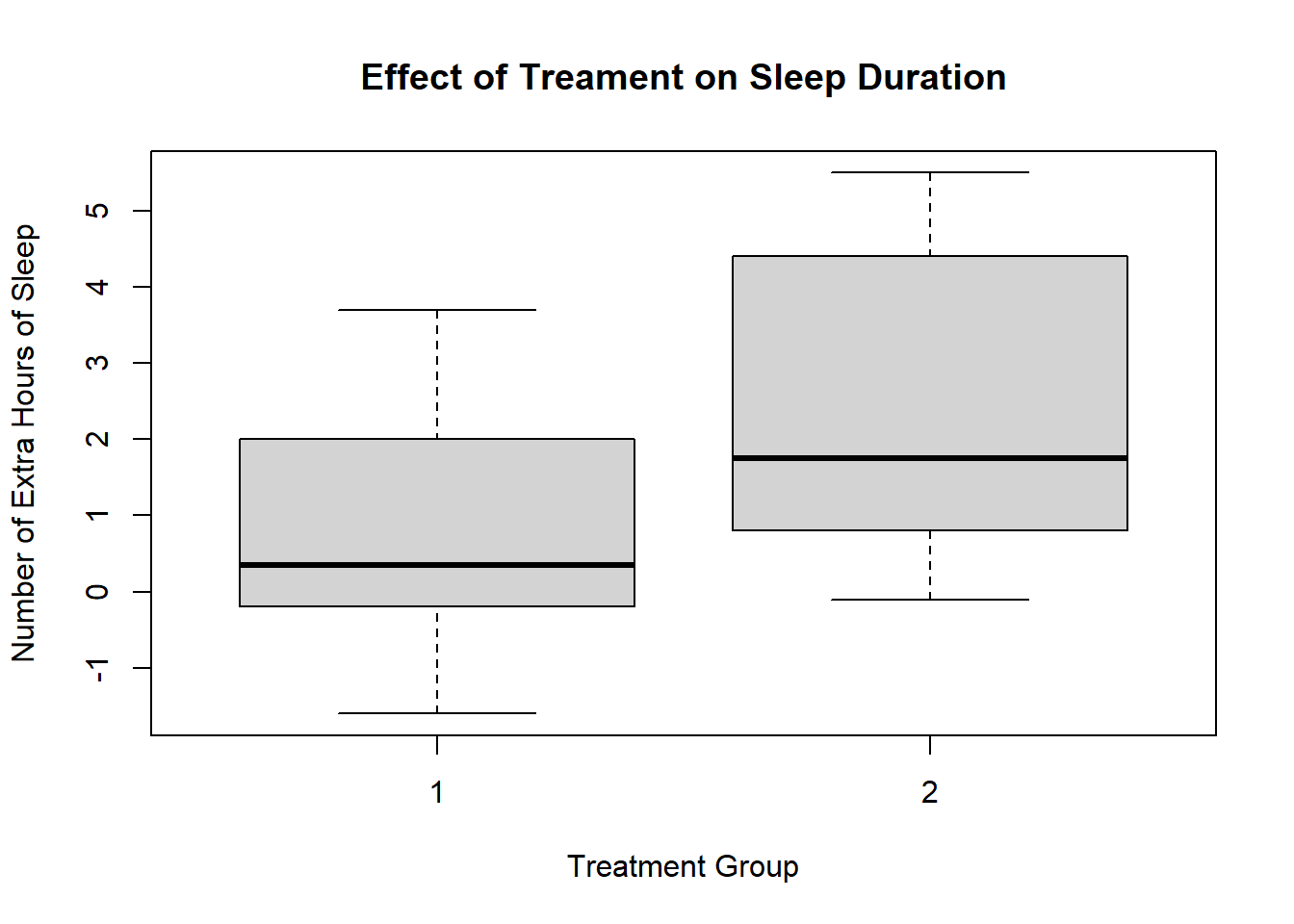
This is a perfectly fine plot. But R is capable of making plots that are significantly nicer and elegant. This ability represents a significant advantage of using R over other programmning languages or statistical softwaere. This is thanks to the ggplot2 package and the ggplot() function.
NB Please refer to the associated data visualization chapter of the online textbook for more details on ggplot2.
Let’s recreate the plot we made in the first session using ggplot this time. Once we have done that, I will show you how we can make the plot even better using this function. We will be using the sleep data frame which is inbuilt into R again, but I am going to call it df for short.
df <- sleepThe first thing we do when we want to create a plot is call the ggplot() function and tell it what data frame we are using In this case, we are using the sleep data frame, that is stored in the variable df. Let’s call the ggplot() function.
ggplot(df)
This creates a grey canvas where we can draw our plot on. The default R canvas is grey, but we can change its appearance later.
Now that our canvas is set up, we will want to specify some aesthetic properties to our plot, like the y-axis and x-axis.
Now we will want to add properties to our canvas, like the x and y-axis. This properties are known as aesthetic properties in ggplot. To create them, we need tell R to map the x-axis and y-axis to variables in our data frame (e.g. df). In ggplot, there is an argument called mapping = aes() that enables this mapping. The part aes is short for aesthetics. Let’s map the group variable to the x-axis and the extra variable to the y-axis.
ggplot(df, mapping = aes(x = group, y = extra))
Now we can see that our x-axis is mapped to the two values in our group variable(1 and 2), whereas the y-axis is mapped to the range of values in the extra variable.
This sets up the structure of our canvas, the next thing we need to do is specify what type of plot we want to create. In ggplot, this means draw a geom (i.e., geometrical shape) onto our plot. There are dozens of geoms (see table at end of the chapter) that we can draw to our plot. We can even draw multiple at the same time (more on that later).
For now, we will add a single geom. Since we are creating a boxplot, we’ll add geom_boxplot
ggplot(df, mapping = aes(x = group, y = extra)) +
  geom_boxplot()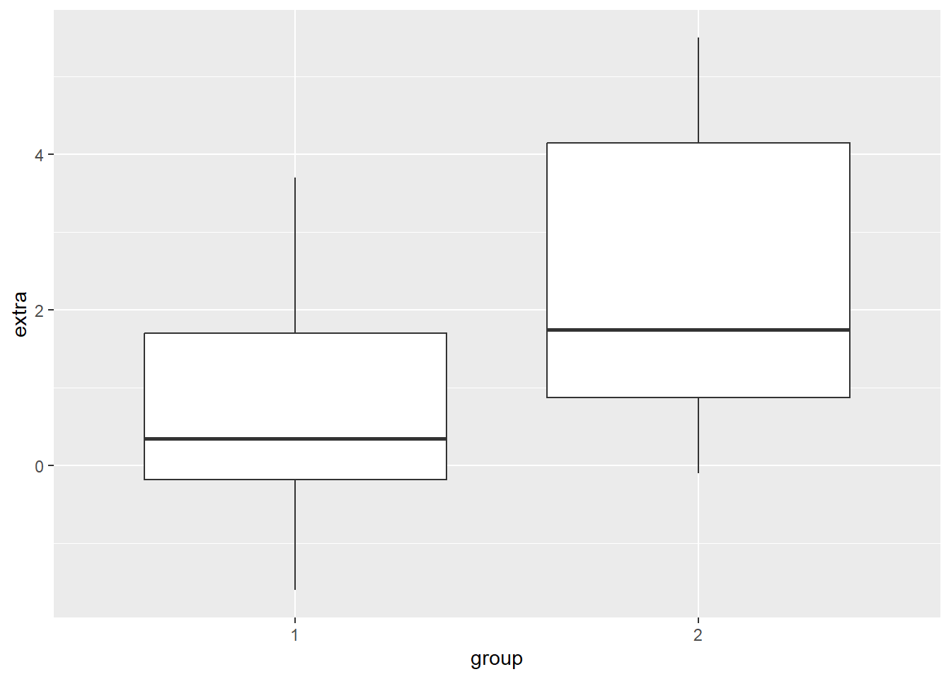
We can see that R has now drawn box plots for each of our groups. You’ll notice that we used the + operator to add these parts together. This is because we are literally adding this boxplot shape to the canvas we created earlier. Whenever you add a separate element to your graph in ggplot, we always need to use the + operator.
In terms of syntax, it should always come at the end of line of code, not at the start of a new line. If it comes at the start of a new line, R will only use the code above that line. The `+`` is there to tell R “hey hold on, I am adding more things to my graph”.
ggplot(df, mapping = aes(x = group, y = extra))
  + geom_boxplot() #will not work, notice the error code
This plot is different from the plot we made in session 1. The default style in ggplot() is not to add the whiskey horizontal lines (e.g., the T) at the top and end of each boxplot. Generally, I am happy with the default option, but since we are recreating our first boxplot, let’s add these whisker lines.
To do this, we need to tell R to create a shape based on statistical properties of our data. In particular, we need to create a statistical error bar for a box plot. We can do this through adding the following line of code in our plot.
ggplot(df, mapping = aes(x = group, y = extra)) +
  stat_boxplot(geom ='errorbar') +
  geom_boxplot()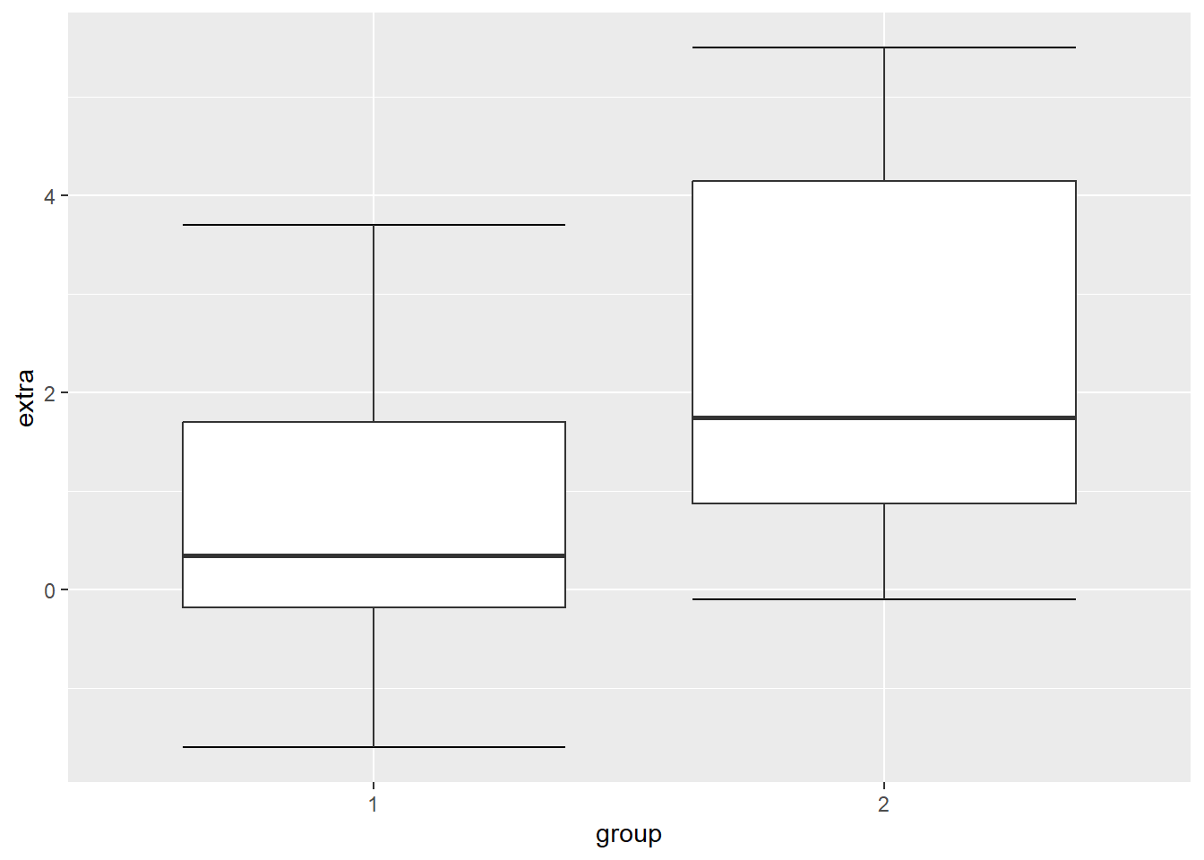
Now we have our whisker lines. The error bar lines are slightly too large for me. We can change their width within the stat_boxplot() function.
ggplot(df, mapping = aes(x = group, y = extra)) +
  stat_boxplot(geom ='errorbar', width = .3) +
  geom_boxplot()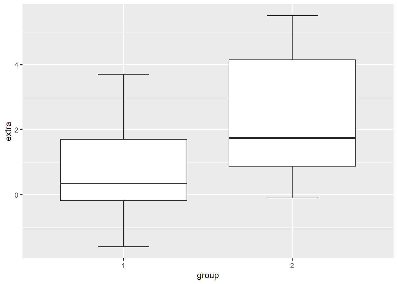
Okay, our plot is looking better. The next thing we will want to do is add informative labels to our x and y-axis. We can do this by using the ggplot functions scale_x_discrete and scale_y_continous to draw our labels.
ggplot(df, mapping = aes(x = group, y = extra)) +
  stat_boxplot(geom ='errorbar', width = .3) +
  geom_boxplot() +
  scale_x_discrete(name = "Treatment Group") +
  scale_y_continuous(name = "Number of Extra Hours of Sleep")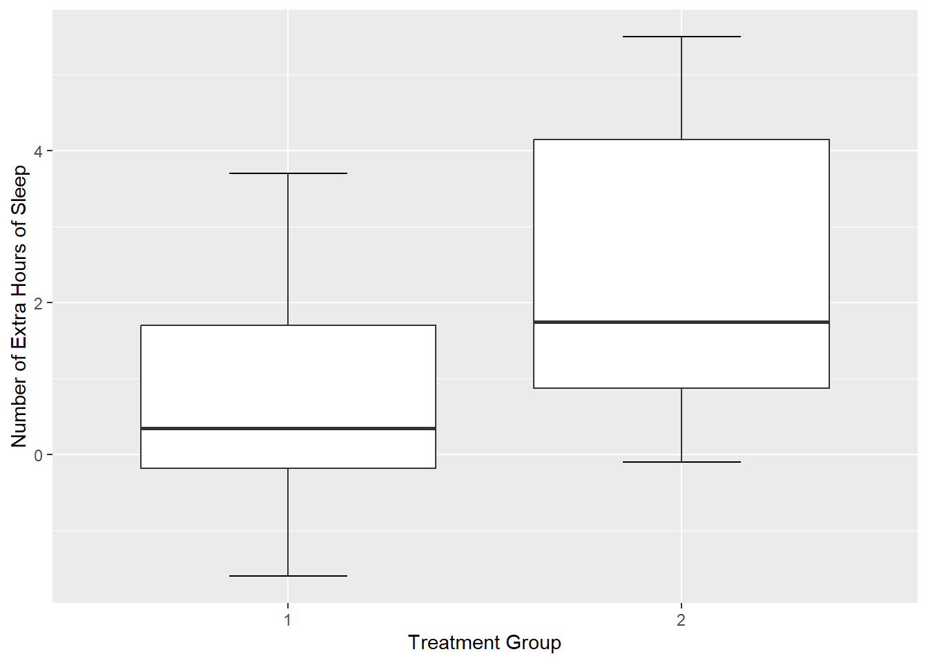
There now we have our x and y-labels. The reason why the x-axis is discrete and the y-axis is continuous is because of the nature of the data. If we flipped the axes, then it would be scale_x_continuous and scale_y_discrete.
One thing that is bothering me is that our treatment group is labelled as 1 and 2. The sleep data frame does not provide us with any meaningful information about what these values mean. So I am going to take artistic liberties and say that 1 means Xanax and 2 means Ambien.
One approach to amend this would be to add labels to the x-axis, in scale_x_discrete().
ggplot(df, mapping = aes(x = group, y = extra)) +
  stat_boxplot(geom ='errorbar', width = .3) +
  geom_boxplot() +
  scale_x_discrete(name = "Treatment Group",
                   labels = c("1"  = "Xanax", #this changes the 1 in the x-axis to Xanax
                              "2" = "Ambien")) +
  scale_y_continuous(name = "Number of Extra Hours of Sleep")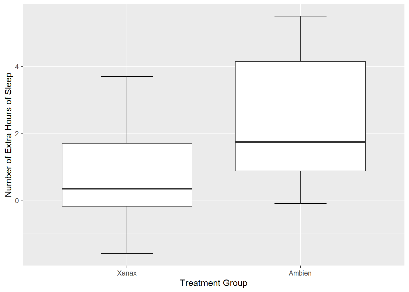
One of the nice features of ggplot() is can change the theme of our canvas. There are several themes that we can use (nb see theme table at the end of the chapter). The current theme we are using is theme_gray, which is the default theme.
ggplot(df, mapping = aes(x = group, y = extra)) +
  stat_boxplot(geom ='errorbar', width = .3) +
  geom_boxplot() +
   scale_x_discrete(name = "Treatment Group",
                   labels = c("1"  = "Xanax", #this changes the 1 in the x-axis to Xanax
                              "2" = "Ambien")) +
  scale_y_continuous(name = "Number of Extra Hours of Sleep") +
  theme_gray()
I personally dislike the grey colour, so let’s change it to something else. We could set it to theme_bw (white background and black gridlines).
ggplot(df, mapping = aes(x = group, y = extra)) + #substitute treatment for group
  stat_boxplot(geom ='errorbar', width = .3) +
  geom_boxplot() +
   scale_x_discrete(name = "Treatment Group",
                   labels = c("1"  = "Xanax", #this changes the 1 in the x-axis to Xanax
                              "2" = "Ambien")) +
  scale_y_continuous(name = "Number of Extra Hours of Sleep") +
  theme_bw()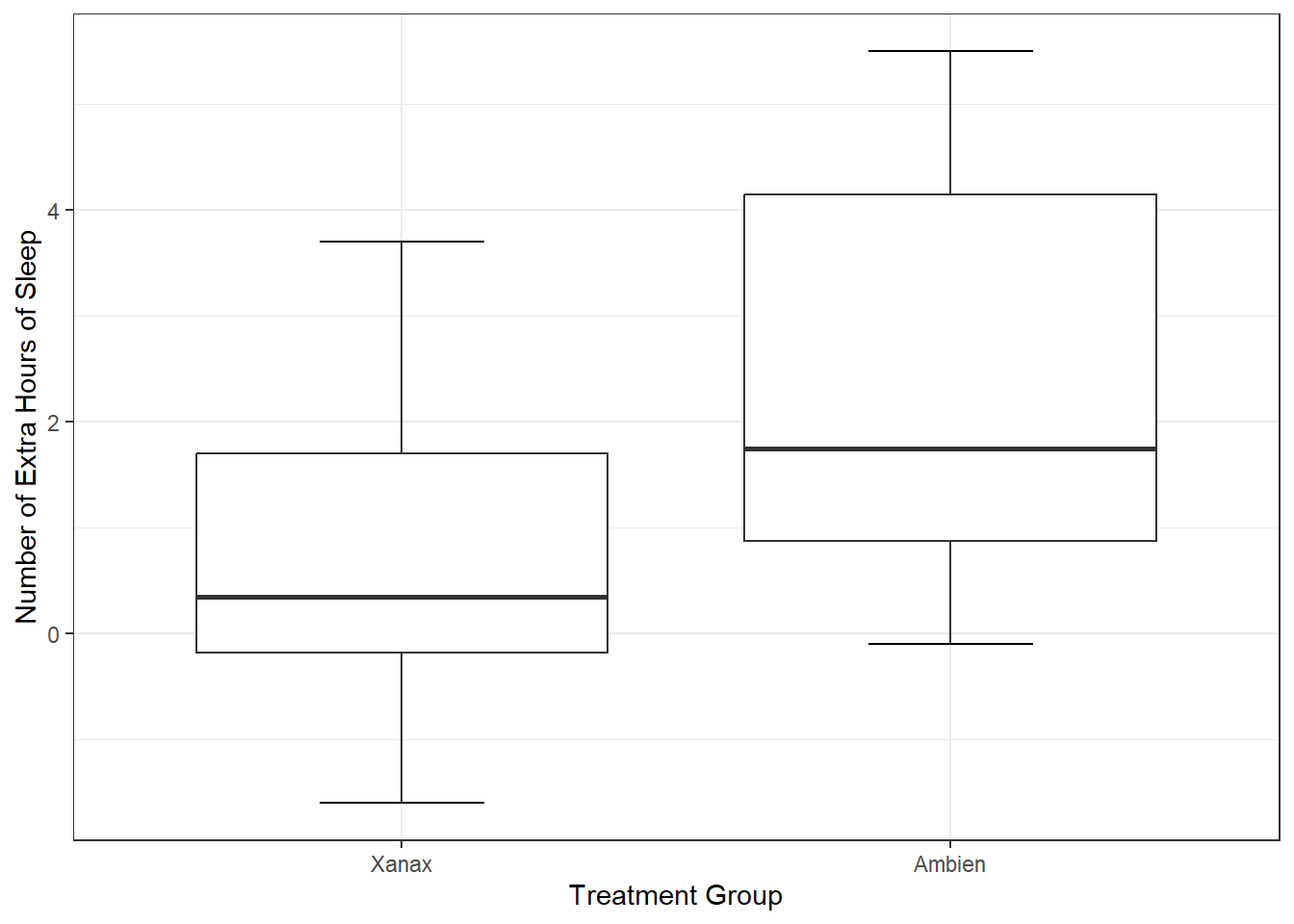
Now try the following themes:
Setting it to a dark theme, using theme_dark()
Removing the grid lines to have a more classic approach, using theme_classic()
Setting it to a dark theme, using theme_dark()
ggplot(df, mapping = aes(x = group, y = extra)) +
  stat_boxplot(geom ='errorbar', width = .3) +
  geom_boxplot() +
   scale_x_discrete(name = "Treatment Group",
                   labels = c("1"  = "Xanax", #this changes the 1 in the x-axis to Xanax
                              "2" = "Ambien")) +
  scale_y_continuous(name = "Number of Extra Hours of Sleep") +
  theme_dark()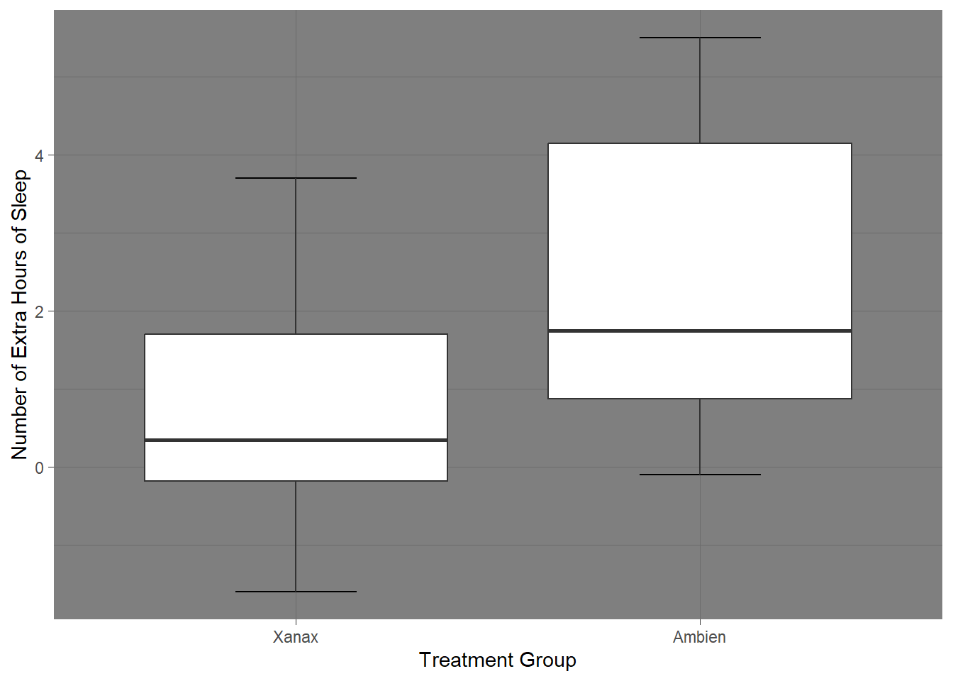
Removing the grid lines to have a more classic approach, using theme_classic()
ggplot(df, mapping = aes(x = group, y = extra)) +
  stat_boxplot(geom ='errorbar', width = .3) +
  geom_boxplot() +
   scale_x_discrete(name = "Treatment Group",
                   labels = c("1"  = "Xanax", #this changes the 1 in the x-axis to Xanax
                              "2" = "Ambien")) +
  scale_y_continuous(name = "Number of Extra Hours of Sleep") +
  theme_classic()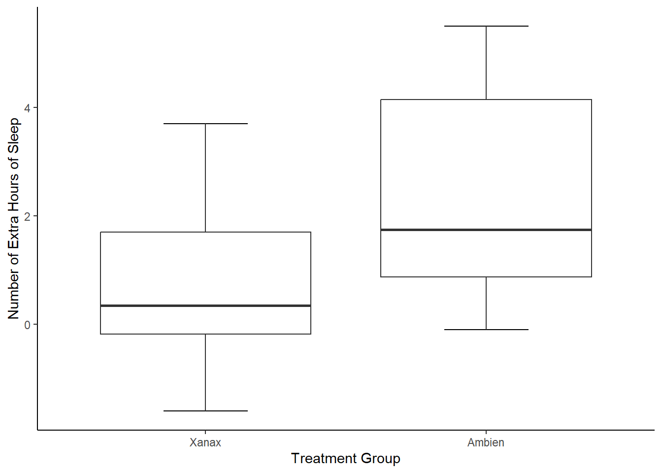
Since we are psychologists, we will mostly need plots in APA style. The package ggplot2 does not actually come with a pre-installed APA style. However, this is where the jtools package we installed and loaded comes in. It has an apa_theme(). Make sure that is loaded before running the following code:
ggplot(df, mapping = aes(x = group, y = extra)) +
  stat_boxplot(geom ='errorbar', width = .3) +
  geom_boxplot() +
   scale_x_discrete(name = "Treatment Group",
                   labels = c("1"  = "Xanax", #this changes the 1 in the x-axis to Xanax
                              "2" = "Ambien")) +
  scale_y_continuous(name = "Number of Extra Hours of Sleep") +
  theme_apa()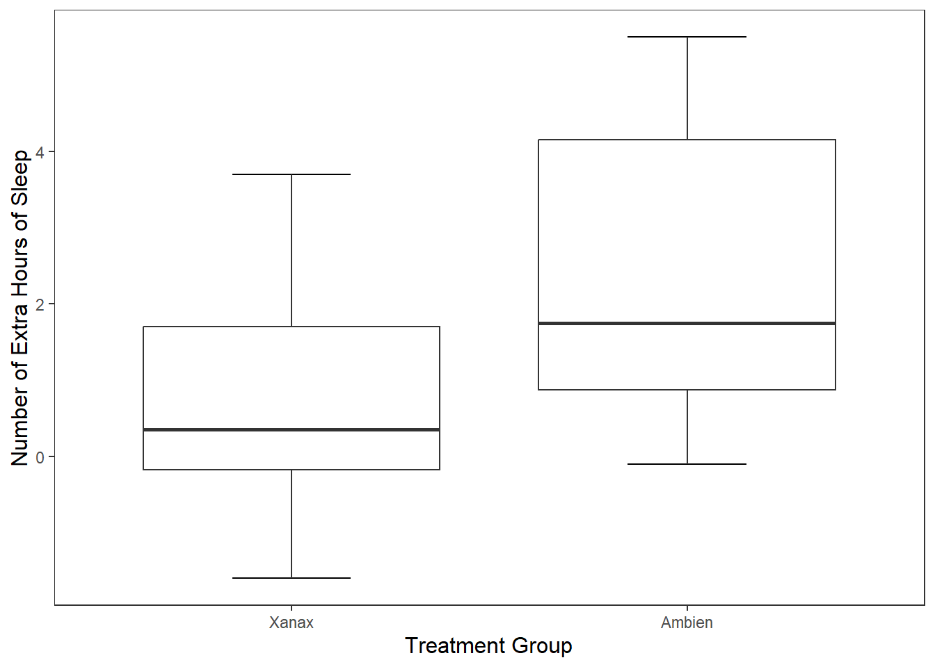
And now we have a pretty nice looking plot. To more accurately match our original plot, let’s change the colour inside the boxplots. We can do this by adding the code fill = "grey" inside geom_boxplot().
ggplot(df, mapping = aes(x = group, y = extra)) +
  stat_boxplot(geom ='errorbar', width = .3) +
  geom_boxplot(fill = "grey") + #this will fill the inside of the boxplots with grey
   scale_x_discrete(name = "Treatment Group",
                   labels = c("1"  = "Xanax", #this changes the 1 in the x-axis to Xanax
                              "2" = "Ambien")) +
  scale_y_continuous(name = "Number of Extra Hours of Sleep") +
  theme_apa()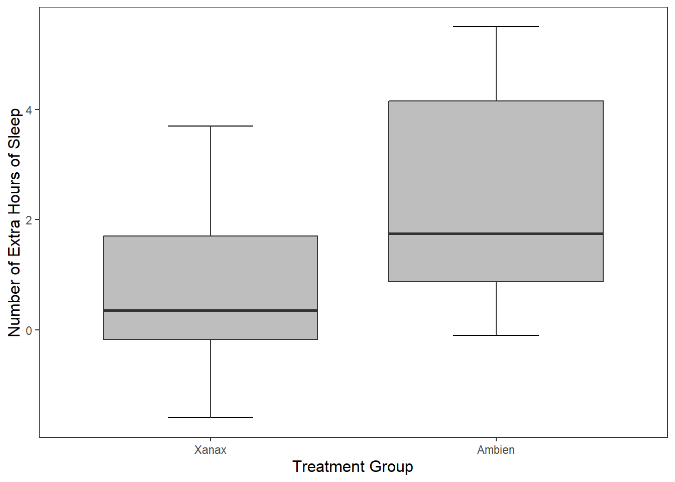
You might be wondering right now how useful is ggplot really. If you compare our two code chunks from base R and ggplot, you’ll notice that the base R approach is significantly shorter.
If we are making a base plot in R, then base R is fine for the job. However, the real power of ggplot is the ability to customize our graphs to make them more striking and informative. We have seen glimpses of this already with the ability to add labels, colour, and themes to our plots. Now I am going to show you more ways we can customise our plot.
In the last section, we used the argument fill = grey to specify the colour of boxplots. If I wanted to specify different colours for each boxplot, I can use the c() function and specify each separate colour.
ggplot(df, mapping = aes(x = group, y = extra)) +
  stat_boxplot(geom ='errorbar', width = .3) +
  geom_boxplot(fill = c("pink", "orange")) + #this will colour the first box pink and the second box orange
 scale_x_discrete(name = "Treatment Group",
                   labels = c("1"  = "Xanax", #this changes the 1 in the x-axis to Xanax
                              "2" = "Ambien")) +
  scale_y_continuous(name = "Number of Extra Hours of Sleep") +
  theme_apa()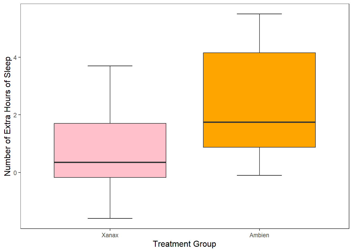
This approach is okay if are only specifying a limited number of colours, but if there are several colours we need to specify, it is cumbersome.
It is okay to manually specify the colours, particularly if you have a small number of box plots. However, one of the advantages of using R is getting it to do the work for you. In particular, we can ask R to map the colour of the boxplots to specific values in our data frame.
We can do this through a similar approach used in ggplot() where we add the argument mapping = aes() to our geom_boxplot() function. This time inside the aes() argument, we specify that we want the fill (the colour inside our boxplots) to map to the variable group.
ggplot(df, mapping = aes(x = group, y = extra)) +
  stat_boxplot(geom ='errorbar', width = .3) +
  geom_boxplot(mapping = aes(fill = group)) + #R will automatically assign a new colour to each different value in group
 scale_x_discrete(name = "Treatment Group",
                   labels = c("1"  = "Xanax", #this changes the 1 in the x-axis to Xanax
                              "2" = "Ambien")) +
  scale_y_continuous(name = "Number of Extra Hours of Sleep") +
  theme_apa()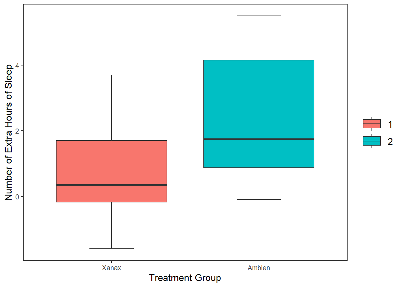
NB you may notice that the legend labels (1, 2) are not the most informative. This is because when we relabel them on the x axis this just relabels them there. Next week we are going to learn a neater way to change the labels in the data itself.
For now, if you want to remove the legend, add show.legend = FALSE to the geom_boxplot() function.
ggplot(df, mapping = aes(x = group, y = extra)) +
  stat_boxplot(geom ='errorbar', width = .3) +
  geom_boxplot(mapping = aes(fill = group), show.legend = FALSE) + #R will automatically assign a new colour to each different value in group
 scale_x_discrete(name = "Treatment Group",
                   labels = c("1"  = "Xanax", #this changes the 1 in the x-axis to Xanax
                              "2" = "Ambien")) +
  scale_y_continuous(name = "Number of Extra Hours of Sleep") +
  theme_apa()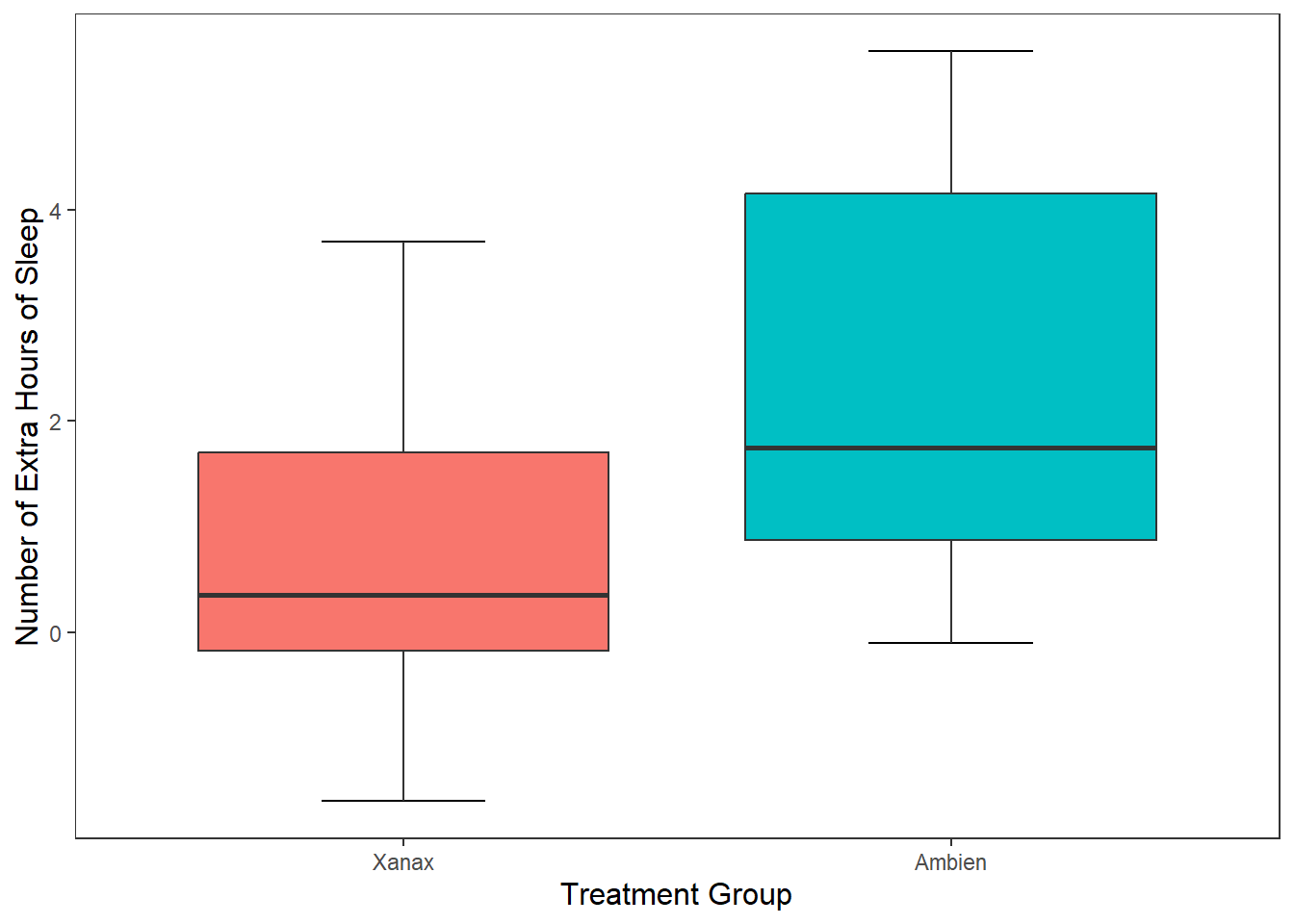
I can tell R to specify the number of breaks on the y-axis. At the moment, it is only showing breaks in increments of two. R will try find a straightforward solution to the number of points on the y-axis. We can override this by using the breaks() argument in scale_y_continous, which will add a break between each number specified.
ggplot(df, mapping = aes(x = group, y = extra)) +
  stat_boxplot(geom ='errorbar', width = .3) +
  geom_boxplot(mapping = aes(fill = group), show.legend = FALSE) + #R will automatically assign a new colour to each different value in group
 scale_x_discrete(name = "Treatment Group",
                   labels = c("1"  = "Xanax", #this changes the 1 in the x-axis to Xanax
                              "2" = "Ambien")) +
  scale_y_continuous(name = "Number of Extra Hours of Sleep",
                     breaks = c(-2:6) #this will add a break for each value between -2 and +6
                  ) +
  theme_apa()
We can also change the orientation of our graph in ggplot(). All we need to do is change the x and y values in the ggplot() call. And then we just need to change scale_y_continuous to scale_y_discrete, and scale_x_discrete to scale_x_continuous.
ggplot(df, mapping = aes(x = extra, y = group)) +
  stat_boxplot(geom ='errorbar', width = .3) +
  geom_boxplot(mapping = aes(fill = group), show.legend = FALSE) +
  scale_y_discrete(name = "Treatment Group",
                   labels = c("1"  = "Xanax", #this changes the 1 in the x-axis to Xanax
                              "2" = "Ambien")) +
  scale_x_continuous(name = "Number of Extra Hours of Sleep",
                     breaks = c(-2:6) #this will add a break for each value between -2 and +6
                     ) +
  theme_apa()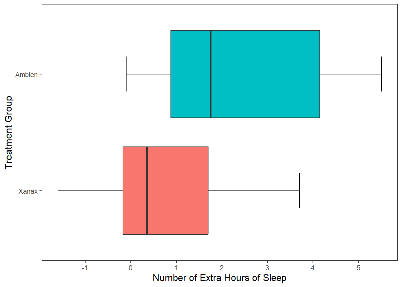
What if I wanted to add individual data points to our graph? To provide more information on the scatter of scores? There are two options I can use. The first option is to the use the geom_point(), which will each participant’s data point to the graph. Since there are only two possible observations in the x-axis, all data points will be printed in a straight line for each observation.
ggplot(df, mapping = aes(x = group, y = extra)) +
  stat_boxplot(geom ='errorbar', width = .3) +
  geom_boxplot(mapping = aes(fill = group), show.legend = FALSE) +
  scale_x_discrete(name = "Treatment Group",
                   labels = c("1"  = "Xanax", #this changes the 1 in the x-axis to Xanax
                              "2" = "Ambien")) +
  scale_y_continuous(name = "Number of Extra Hours of Sleep",
                     breaks = c(-2:6) #this will add a break for each value between -2 and +6
                     ) +
  theme_apa() +
  geom_point() #will add individual scores onto to the graph
This is a perfectly legitimate approach to take. There is not a lot of data, so we can make our each individual point, even if there is some overlap. However, we can use another approach called geom_jitter(). This will plot each individual point just like geom_point() does, but it will add some random movement (i.e. a jitter) to each point. This can prevent overplotting of individual points.
ggplot(df, mapping = aes(x = group, y = extra)) +
  stat_boxplot(geom ='errorbar', width = .3) +
  geom_boxplot(mapping = aes(fill = group), show.legend = FALSE) +
  scale_x_discrete(name = "Treatment Group",
                   labels = c("1"  = "Xanax", #this changes the 1 in the x-axis to Xanax
                              "2" = "Ambien")) +
  scale_y_continuous(name = "Number of Extra Hours of Sleep",
                     breaks = c(-2:6) #this will add a break for each value between -2 and +6
                     ) +
  theme_apa() +
  geom_jitter() #will add individual scores onto to the graph and give them space away from each other
The added space left or right for each data point is randomly generated. But we can reduce the upper and lower bounds of that random generation. Let’s do that for our current plot.
ggplot(df, mapping = aes(x = group, y = extra)) +
  stat_boxplot(geom ='errorbar', width = .3) +
  geom_boxplot(mapping = aes(fill = group), show.legend = FALSE) +
  scale_x_discrete(name = "Treatment Group",
                   labels = c("1"  = "Xanax", #this changes the 1 in the x-axis to Xanax
                              "2" = "Ambien")) +
  scale_y_continuous(name = "Number of Extra Hours of Sleep",
                     breaks = c(-2:6) #this will add a break for each value between -2 and +6
                     ) +
  theme_apa() +
  geom_jitter(width = .20) #will add individual scores onto to the graph and give them space away from each other
We can also add statistical summary information to our plot. Right now our boxplot tells us about individual scores, the median score, and the range of values. What if we wanted it to visualise the mean score treatment group?
No problem. To do this, we need to tell R to draw a geom shape in the position of the mean score. The easiest geom to do this with is geom_point().
ggplot(df, mapping = aes(x = group, y = extra)) +
  stat_boxplot(geom ='errorbar', width = .3) +
  geom_boxplot(mapping = aes(fill = group), show.legend = FALSE) +
   scale_x_discrete(name = "Treatment Group",
                   labels = c("1"  = "Xanax", #this changes the 1 in the x-axis to Xanax
                              "2" = "Ambien")) +
  scale_y_continuous(name = "Number of Extra Hours of Sleep",
                     breaks = c(-2:6) #this will add a break for each value between -2 and +6
                     ) +
  theme_apa() +
  geom_jitter(width = .20) +
geom_point(stat = "summary", fun = "mean", size = 5, colour = "black") 
This draws a dot exactly where the mean value falls for both the Xanax and Ambien treatment groups fall. I changed the size of the point to make it more visible salient than the other data points. We could have also change the colour (try it!)
We can also add the results of a t-test to the plot to make it easier for our readers to interpret. We do this by using the annotate() function. We want to add the following results: t(9) = 4.061, p = .002**
ggplot(df, mapping = aes(x = group, y = extra)) +
  stat_boxplot(geom ='errorbar', width = .3) +
  geom_boxplot(mapping = aes(fill = group), show.legend = FALSE) +
  scale_x_discrete(name = "Treatment Group",
                   labels = c("1"  = "Xanax", #this changes the 1 in the x-axis to Xanax
                              "2" = "Ambien")) +
  scale_y_continuous(name = "Number of Extra Hours of Sleep",
                     breaks = c(-2:6) #this will add a break for each value between -2 and +6
                     ) +
  theme_apa() +
  geom_jitter(width = .20) +
  geom_point(stat = "summary", fun = "mean", size = 5, colour = "black") +
  annotate("text",
           label = "t(9) = 4.061, p = .002**.",
           x = 2,
           y = 5.5,
           hjust = 2.2,
           vjust = 1,
           size = 4)
We can export our plot easily using the ggsave() function. Inside the function, you specify the file name. It will save the file into your working directory.
By default, this function will export the last plot that you displayed. That is why it always best this function directly underneath the plot you made in your code.
ggplot(df, mapping = aes(x = group, y = extra)) +
  stat_boxplot(geom ='errorbar', width = .3) +
  geom_boxplot(mapping = aes(fill = group), show.legend = FALSE) +
  scale_x_discrete(name = "Treatment Group",
                   labels = c("1"  = "Xanax", #this changes the 1 in the x-axis to Xanax
                              "2" = "Ambien")) +
  scale_y_continuous(name = "Number of Extra Hours of Sleep",
                     breaks = c(-2:6) #this will add a break for each value between -2 and +6
                     ) +
  theme_apa() +
  geom_jitter(width = .20) +
  geom_point(stat = "summary", fun = "mean", size = 5, colour = "black") +
  annotate("text",
           label = "t(9) = 4.061, p = .002**.",
           x = 2,
           y = 5.5,
           hjust = 2.2,
           vjust = 1,
           size = 4)


ggsave("sleep_boxplot.pdf")
You should find the file sleep_boxplot.pdf in your working directory now. Open it up and have a look.
Okay, so we talked a lot step by step how to create a box plot. Let’s talk in somewhat less detail about how to create a scatter plot. After we have covered those two charts, the rest of this workship will allow you to build on this knowledge to create other charts you might be interested in making (e.g., bar charts, line charts, histograms, violin plots).
In this study (by one Dr Ryan Donovan), they investigated the relationships between basic emotional states (Anger, Disgust, Fear, Joy, Sadness, and Surprise) and the Big Five personality traits and their sub-traits. They were interested in knowing whether personality traits make one more or less likely to a) experience certain emotions and b) be more sensitive to those emotions. To achieve this, they collected data on the personality traits along with participant’s daily experience of basic emotional states (baseline) and their reactive emotional experience after watching a series of emotionally provocative video clips (post-stimulus)
We already saved this as df_personality, so lets use the str() function to get to grips with this dataset more.
str(df_personality)'data.frame': 202 obs. of 36 variables:
$ X : int 1 2 3 4 5 6 7 8 9 10 ...
$ hash : chr "00df03f53d53a2e3e32052b1c5a6a34f958773d6" "04a579b9da02f9d2fae2b28775c81b623aac8e9b" "051e9ca781614d3ea9f487741e131024495b237b" "055e431c004175cb182f8790803f37f156cf35ed" ...
$ Openness_experience: num 3.55 3.45 2 3.65 3.2 3.35 3.95 3.1 4.25 4.45 ...
$ Intellect : num 4.2 3.4 1.9 4.2 2.8 3.8 3.6 3.5 4.1 4.3 ...
$ Openness : num 2.9 3.5 2.1 3.1 3.6 2.9 4.3 2.7 4.4 4.6 ...
$ Conscientiousness : num 3.4 2.9 4.2 2.75 2.9 3.95 3.2 3.8 3.55 2.85 ...
$ Industriousness : num 3.9 3.4 4.4 3 3 4.3 2.3 4.3 3.8 2.9 ...
$ Orderliness : num 2.9 2.4 4 2.5 2.8 3.6 4.1 3.3 3.3 2.8 ...
$ Extraversion : num 3.1 3.25 4.3 3.2 3.35 3.7 3.3 3.55 2.75 3.7 ...
$ Assertiveness : num 3.3 3.3 4.6 2.9 3.1 3.1 2.6 3.2 3 3.6 ...
$ Enthusiasm : num 2.9 3.2 4 3.5 3.6 4.3 4 3.9 2.5 3.8 ...
$ Agreeableness : num 3.85 3.65 1.95 3.85 3.7 3.95 4.45 4.2 4 4.2 ...
$ Compassion : num 3.7 3.7 2.1 4 3.5 3.9 5 4.1 3.9 4.6 ...
$ Politeness : num 4 3.6 1.8 3.7 3.9 4 3.9 4.3 4.1 3.8 ...
$ Neuroticism : num 1.9 3.05 3.05 3.35 2.7 1.95 4.4 1.8 3.1 3.1 ...
$ Volatility : num 1.8 3.6 3.6 3 2.3 2.1 4.3 1.6 3 3.1 ...
$ Withdrawal : num 2 2.5 2.5 3.7 3.1 1.8 4.5 2 3.2 3.1 ...
$ Anger_reaction : num 2.17 1.33 2.17 1.33 2.17 ...
$ Disgust_reaction : num 2.67 1.67 2.17 1.33 3.33 ...
$ Fear_reaction : num 2.5 1.33 1.67 1.5 3.17 ...
$ Joy_reaction : num 2.17 3.17 2.17 2.17 2.67 ...
$ Sadness_reaction : num 2 2 1.33 2.17 3.33 ...
$ Surprise_reaction : num 3.67 3 2.33 1.83 4.67 ...
$ Anger_baseline : int 1 1 3 1 1 1 3 1 1 2 ...
$ Disgust_baseline : int 1 1 4 1 1 1 2 1 1 1 ...
$ Fear_baseline : int 1 1 1 2 2 1 2 1 2 1 ...
$ Joy_baseline : int 2 2 3 3 4 3 2 3 3 3 ...
$ Sadness_baseline : int 1 1 1 2 3 1 4 1 3 2 ...
$ Surprise_baseline : int 1 3 1 2 1 2 1 1 2 2 ...
$ Country_Birth : chr "Ireland" "Pakistan" "United Kingdom" "United Kingdom" ...
$ Gender : chr "Male" "Male" "Female" "Male" ...
$ Education : chr "Bachelor's Degree" "Bachelor's Degree" "Master's Degree" "Bachelor's Degree" ...
$ Language : chr "English" "English" "English" "English" ...
$ Nationality : chr "Irish" "British" "English" "English" ...
$ Publication : chr "Yes" "No" "No" "No" ...
$ Age : int 50 54 31 36 42 24 29 30 65 41 ...You’ll notice that is a large data frame, with 35 variables and 203 participants. Feel free to have a thorough look at it using View(). But that each emotion is measured twice, once at the start of the study(e.g., Anger_baseline) and once as an average reaction to several video clips (Anger_reaction).
One of the hypotheses was that Extraverts are more sensitive to experiencing Joy than Introverts. Many researchers claim that one of the driving differences between Extraverts and Introverts is that Extraverts are more sensitive to experiencing positive emotion, making them more excitable and sociable. If this is true, then I would expect there to be a positive relationship between my Extraversion and Joy_reaction variables.
Let’s visualize this relationship by creating a scatterplot in R. There are several steps we need to take to do this.
First, let’s call the ggplot() function, mapping Extraversion to the x-axis and Joy_reaction to the y-axis with the mapping = aes() call.
ggplot(df_personality, mapping = aes(x = Extraversion, y = Joy_reaction))
Now let’s add our geometrical shape. For scatter plots, this is our old friend geom_point().
ggplot(df_personality, mapping = aes(x = Extraversion, y = Joy_reaction)) +
  geom_point()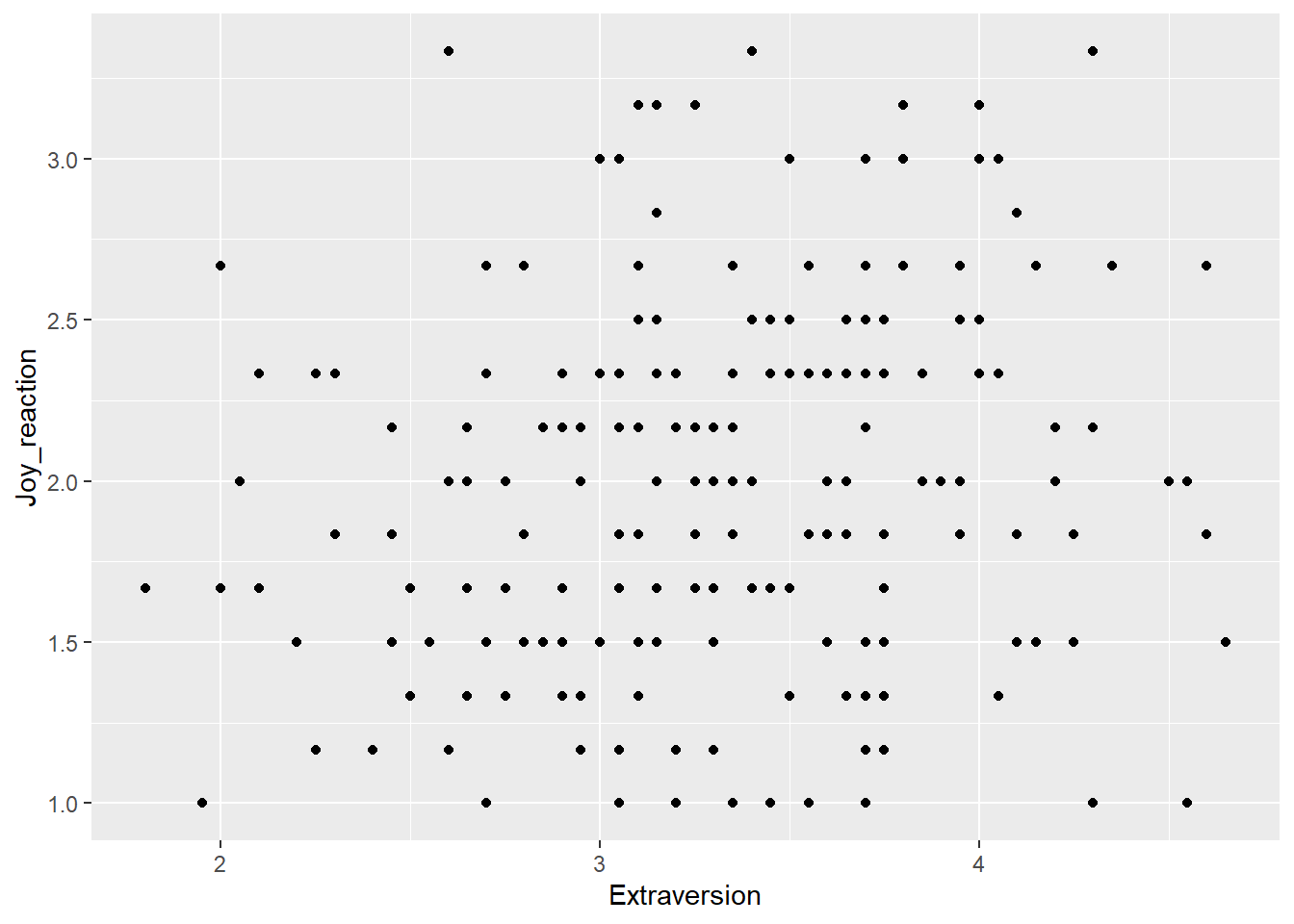
I am happy with the x-axis, but I would like the make the y-axis look more professional. So let’s use scale_y_continous() to change its label.
ggplot(df_personality, mapping = aes(x = Extraversion, y = Joy_reaction)) +
  geom_point() +
scale_y_continuous(name = "Mean Experience of Joy (Reaction)") 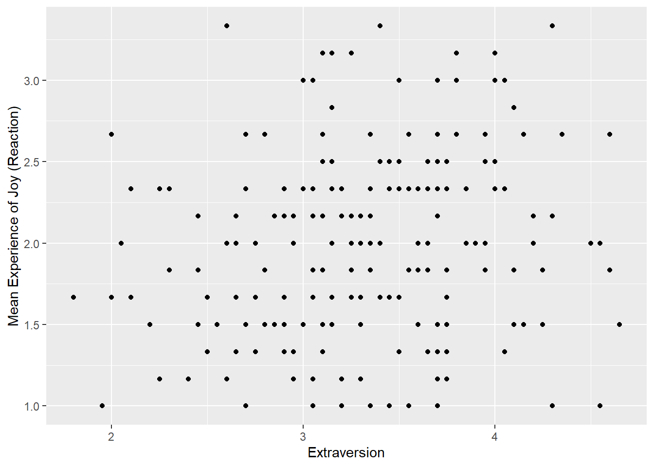
Let’s make our plot prettier by adding the APA theme.
ggplot(df_personality, mapping = aes(x = Extraversion, y = Joy_reaction)) +
  geom_point() +
  scale_y_continuous(name = "Mean Experience of Joy (Reaction)") +
  theme_apa()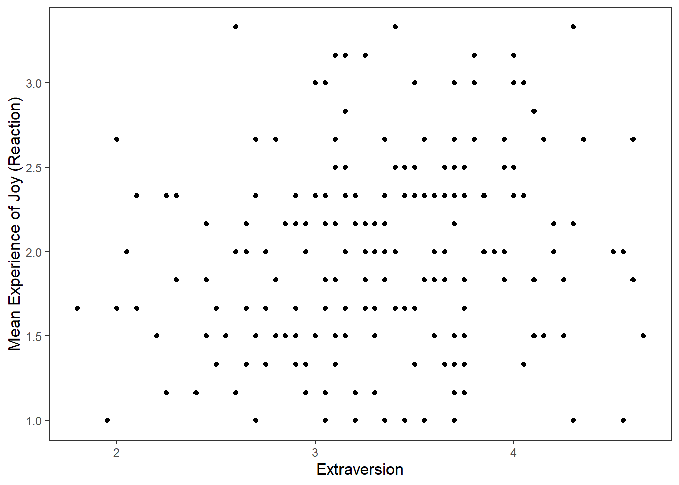
It’s good to provide some information on the relationship between two variables on a scatter plot. We can do this by adding a regression line that best fits their relationship. To do this in R, we add a geom called geom_smooth, where we specify the model (method) we want to fit onto our data.
ggplot(df_personality, mapping = aes(x = Extraversion, y = Joy_reaction)) +
  geom_point() +
  scale_y_continuous(name = "Mean Experience of Reaction Joy", breaks = c(1:5)) +
  scale_x_continuous(breaks = c(1:5)) +
  theme_apa() +
  geom_smooth(method = lm, show.legend = FALSE)
`geom_smooth()` using formula = 'y ~ x'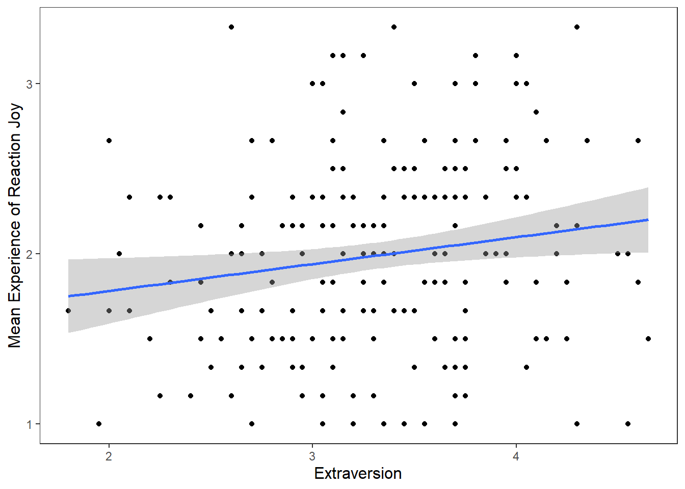
The function geom_smooth fits a model onto our data. When you specify method = lm, this mean that you are fitting a linear regression onto your data. I also set show.legend = FALSE because it create an annoying figure that we don’t need.
Based on what we know from our previous sessions (e.g. Week 7) and earlier in this workshop, do the following:
Run a simple linear regression between Joy_reaction and Extraversion, call this linear model joy_ext
Add the results of this model to your graph using annotate
Running the linear model:
joy_ext <- lm(Joy_reaction ~ Extraversion, data = df_personality)

summary(joy_ext)
Call:
lm(formula = Joy_reaction ~ Extraversion, data = df_personality)

Residuals:
     Min       1Q   Median       3Q      Max
-1.18570 -0.39361 -0.01269  0.39017  1.45525

Coefficients:
             Estimate Std. Error t value Pr(>|t|)
(Intercept)   1.46794    0.22633   6.486 6.77e-10 ***
Extraversion  0.15775    0.06702   2.354   0.0195 *
---
Signif. codes:  0 '***' 0.001 '**' 0.01 '*' 0.05 '.' 0.1 ' ' 1

Residual standard error: 0.5595 on 200 degrees of freedom
Multiple R-squared:  0.02696,   Adjusted R-squared:  0.02209
F-statistic: 5.541 on 1 and 200 DF,  p-value: 0.01955
Based on our earlier plot and our linear regression model, we can see there is a small positive relationship between Extraversion and Joy (reaction) that is statistically significant. Let’s add this information to our plot using the annote() function.
Adding the results to the graph:
ggplot(df_personality, mapping = aes(x = Extraversion, y = Joy_reaction)) +
  geom_point() +
  scale_y_continuous(name = "Mean Experience of Reaction Joy", breaks = c(1:5)) +
  scale_x_continuous(breaks = c(1:5)) +
  theme_apa() +
  geom_smooth(method = lm, show.legend = F) +
  annotate("text", x = 2.5, y = 3.6,
           label = "F(1, 201) = 5.48, p = .02, R^2 = 0.02")
`geom_smooth()` using formula = 'y ~ x'
While this gets the message across, it is annoying that F, p, and R are not italicised. Additionally, how can we superscript the 2 in R^2? We can use the expression() function inside label. The syntax is a bit clunky, but it will get the job done.
ggplot(df_personality, mapping = aes(x = Extraversion, y = Joy_reaction)) +
  geom_point() +
  scale_y_continuous(name = "Mean Experience of Reaction Joy", breaks = c(1:5)) +
  scale_x_continuous(breaks = c(1:5)) +
  theme_apa() +
  geom_smooth(method = lm, show.legend = F) +
  annotate("text", x = 2.5, y = 3.6,
           label = expression(italic("F")(1, 201) == 5.48~","~italic("p") == .02~","~italic("R")^2 == 0.02))
`geom_smooth()` using formula = 'y ~ x'Warning in is.na(x): is.na() applied to non-(list or vector) of type
'expression'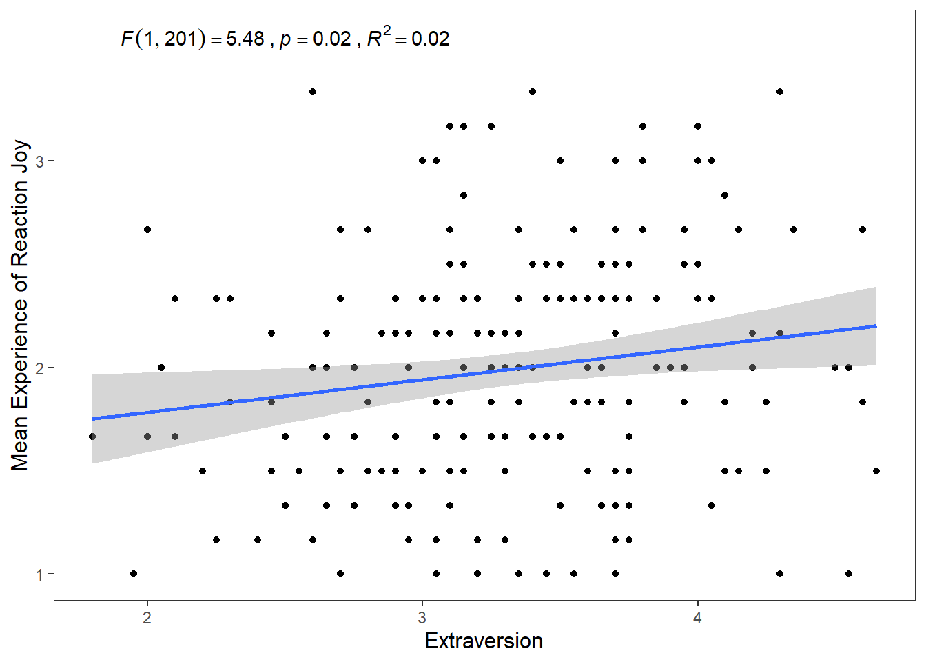
Before we move on, I want to show you a few other things we can do when we create scatter plots. For example, what if we were interested in checking whether the relationship between Joy (Reaction) and Extraversion was similar for both males and females? How could we visualize this?
We can map the colour of the points and their shape to the variable Gender. There are two ways we can do this, through the ggplot() function or in the geom_point(). The way you do will have ramifications for how the data visualisation will appear. It’s easier to show this than to explain. So let’s first change the colour and shape in the ggplot() function by mapping these properties to Gender.
ggplot(df_personality, mapping = aes(x = Extraversion, y = Joy_reaction, colour = Gender, shape = Gender)) +
  geom_point() +
  scale_y_continuous(name = "Mean Experience of Reaction Joy", breaks = c(1:5)) +
  scale_x_continuous(breaks = c(1:5)) +
  theme_apa() +
  geom_smooth(method = lm, show.legend = F) +
  annotate("text", x = 2.5, y = 3.6,
           label = expression(italic("F")(1, 201) == 5.48~","~italic("p") == .02~","~italic("R")^2 == 0.02))
`geom_smooth()` using formula = 'y ~ x'Warning in is.na(x): is.na() applied to non-(list or vector) of type
'expression'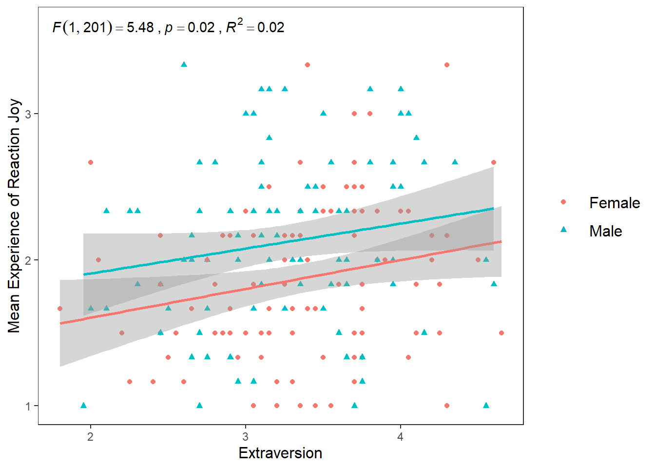
This changes the colour and shape of the data points depending on whether the participant was male or female. It also adds a regression line for the male participants scores and the female participants scores. So we can see that male participants experienced more Joy than female participants during the study, but the nature of the relationship is very similar for both males and females (e.g. small positive relationship).
If we wanted to go with this approach, we could also map the appearance of the linear regression lines to Gender.
ggplot(df_personality, mapping = aes(x = Extraversion,
                                     y = Joy_reaction,
                                     colour = Gender,
                                     shape = Gender,
                                     linetype = Gender)) +
  geom_point() +
  scale_y_continuous(name = "Mean Experience of Reaction Joy", breaks = c(1:5)) +
  scale_x_continuous(breaks = c(1:5)) +
  theme_apa() +
  geom_smooth(method = lm, show.legend = F) +
  annotate("text", x = 2.5, y = 3.6,
           label = expression(italic("F")(1, 201) == 5.48~","~italic("p") == .02~","~italic("R")^2 == 0.02))
`geom_smooth()` using formula = 'y ~ x'Warning in is.na(x): is.na() applied to non-(list or vector) of type
'expression'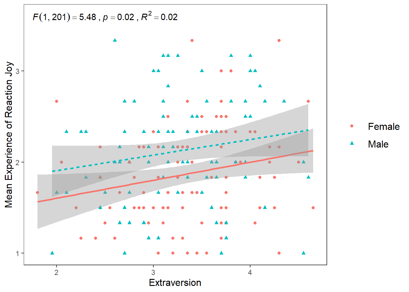
The second way we can map the shape and colour aesthetics is within the geom_point() function.
ggplot(df_personality, mapping = aes(x = Extraversion, y = Joy_reaction)) +
  geom_point(mapping = aes(colour = Gender, shape = Gender)) +
  scale_y_continuous(name = "Mean Experience of Reaction Joy", breaks = c(1:5)) +
  scale_x_continuous(breaks = c(1:5)) +
  theme_apa() +
  geom_smooth(method = lm, show.legend = F) +
  annotate("text", x = 2.5, y = 3.6,
           label = expression(italic("F")(1, 201) == 5.48~","~italic("p") == .02~","~italic("R")^2 == 0.02))
`geom_smooth()` using formula = 'y ~ x'Warning in is.na(x): is.na() applied to non-(list or vector) of type
'expression'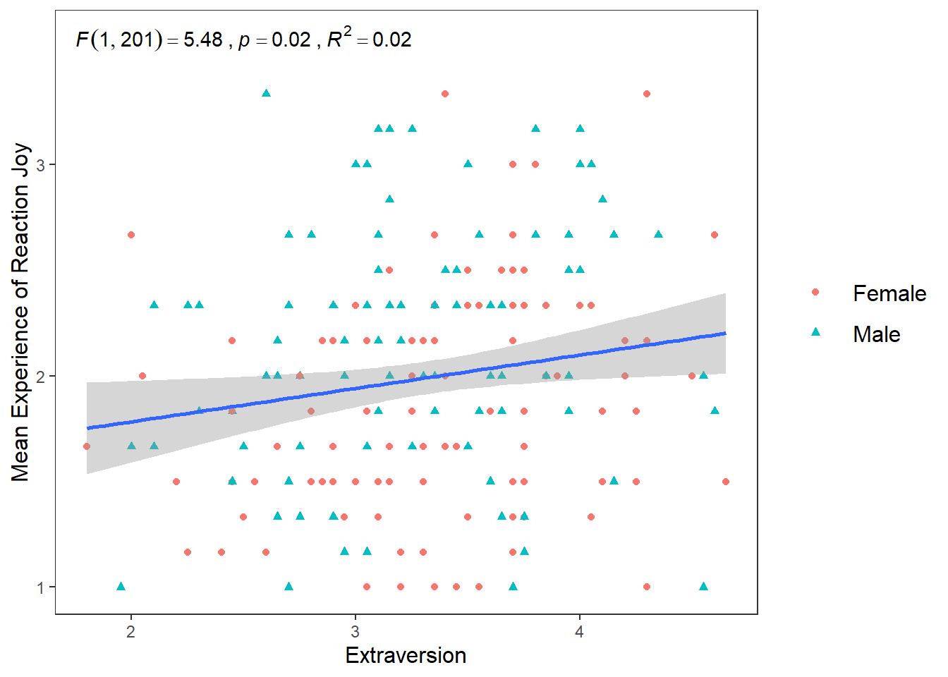
If you compare this plot to the previous approach, you’ll notice that the colours and shape chosen are the same. The only difference is that there is one linear regression line now for the entire data set, rather than two for male and female participants.
This difference happens because of the structure of the ggplot() package. Basically, any aesthetic properties you map in the ggplot() function will be taken into account with everything you add to the plot. So when we map shape, colour, and linetype in ggplot() to Gender, the geom_smooth() function recognizes that we want separate visualizations for male and female participants and adds seperate lines accordingly.
However, when we map aesthetic properties outside of ggplot() and in a separate geom(), this will be restricted to that geom.
To sum it up. If we map our variables to aesthetics in ggplot(), these are global changes. If we map variables to aesthetics outside of ggplot(), this will only make local changes. This ability to choose local or global changes means that the ggplot package system provides a high level of control in creating the plot we want.
What if I wanted to create two plots. A plot for only male scores, and a plot for only female scores? Well we can use the facet_wrap() function which will make a seperate graph based on different values on a specified variable.
The syntax for facet_wrap() is: facet_wrap(~variable you are splitting the graph on)
ggplot(df_personality, mapping = aes(x = Extraversion, y = Joy_reaction)) +
  geom_point(mapping = aes(colour = Gender, shape = Gender)) +
  scale_y_continuous(name = "Mean Experience of Reaction Joy", breaks = c(1:5)) +
  scale_x_continuous(breaks = c(1:5)) +
  theme_apa() +
  geom_smooth(method = lm, show.legend = F) +
  facet_wrap(~Gender)
`geom_smooth()` using formula = 'y ~ x'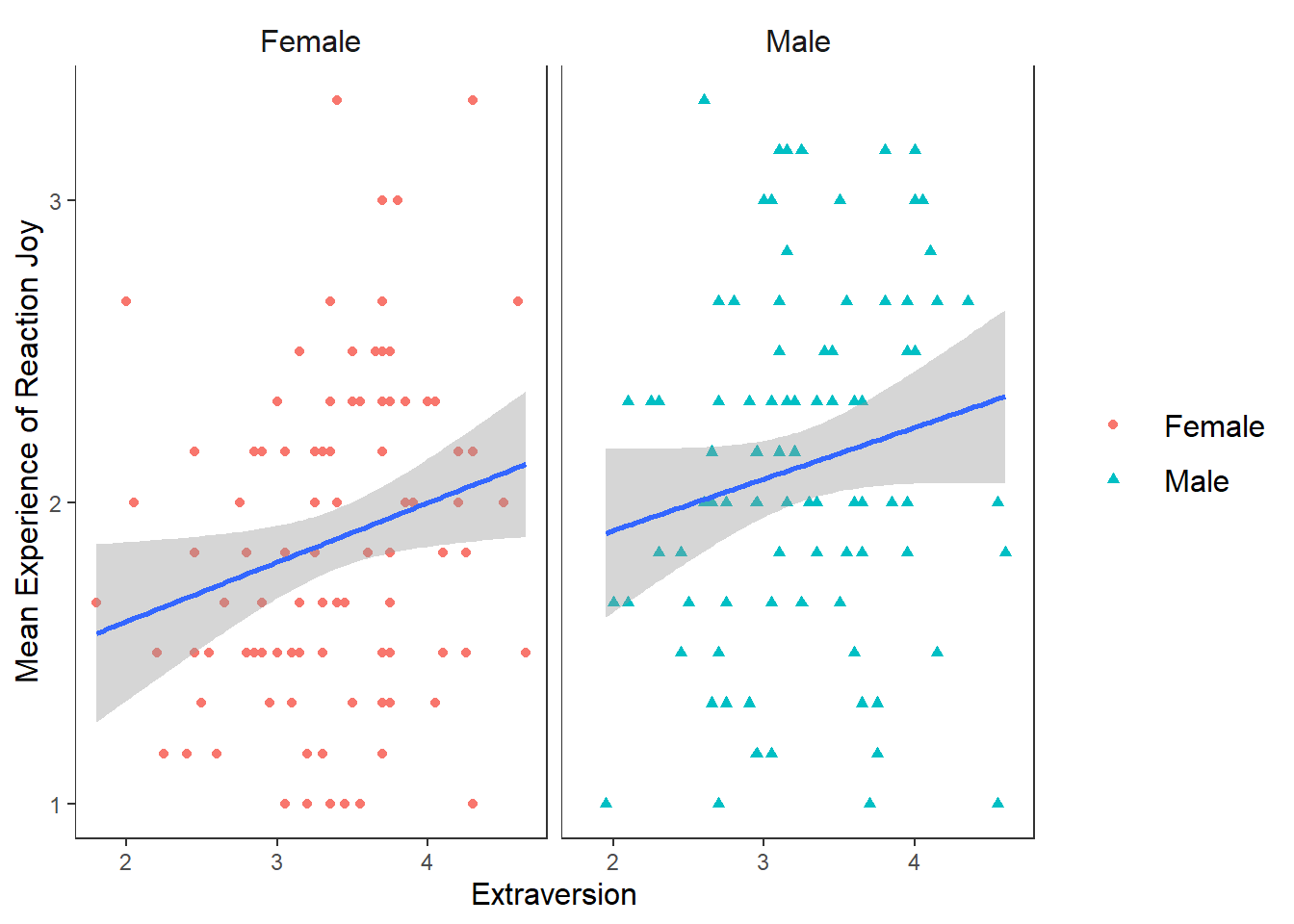
This can be a really useful tool in data exploration when you want to see differences in relationships or effects between different categories or scores.
Now create twoscatterplots like the above, plotting Joy_reaction by Openness, split by Gender.
ggplot(df_personality, mapping = aes(x = Openness, y = Joy_reaction)) +
  geom_point(mapping = aes(colour = Gender, shape = Gender)) +
  scale_y_continuous(name = "Mean Experience of Reaction Joy", breaks = c(1:5)) +
  scale_x_continuous(breaks = c(1:5)) +
  theme_apa() +
  geom_smooth(method = lm, show.legend = F) +
  facet_wrap(~Gender)
`geom_smooth()` using formula = 'y ~ x'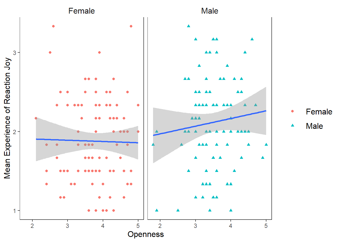
Another hypotheses I wanted to test was if there is a positive relationship between Conscientiousness and Disgust sensitivity. Previous research and some high-profile scholars have made the claim that people who are high in Conscientiousness are more likely to feel disgust, which motivates their tendency to be structured, diligent, and orderly. If this is true, then I would expect there to be a positive relationship between Conscientiousness and Disgust_reaction variable.
Conscientiousness and Disgust_reaction variables.ggplot(df_personality, mapping = aes(x = Conscientiousness, y = Disgust_reaction)) +
geom_point(mapping = aes(colour = Gender, shape = Gender)) +
scale_y_continuous(name = "Mean Experience of Reaction Disgust", breaks = c(1:5)) +
scale_x_continuous(breaks = c(1:5)) +
theme_apa() +
geom_smooth(method = lm, show.legend = F)`geom_smooth()` using formula = 'y ~ x'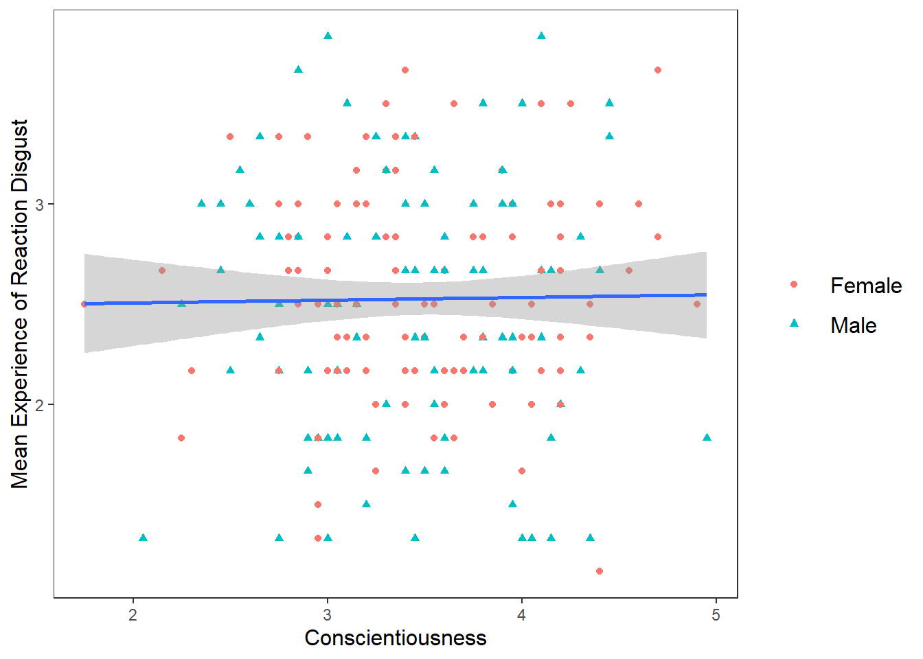
Well that’s as a definite “NO!” that you’re going to see in a scatterplot.
If you wanted to display and export these three plots together (for the sake of it, I am going to add the box plot in here as well), you can use the patchwork package. All you need to do is assign your plots to variable names, and then use the +, | and / operators together.
One thing to note is that you may need to change the appearance of each graph to make it easier to to combine them together. For the following graphs, I removed the legends from the scatter plots (by putting show.legend = FALSE in geom_smooth for both p1 and p2 and in geom_boxplot in p3) and changed the labels on the y-axis. Then I toyed around with their layout to find the layout that was the most informative (feel free to play around with diferent configurations)
p1 <- ggplot(df_personality, mapping = aes(x = Extraversion, y = Joy_reaction)) +
  geom_point(mapping = aes(colour = Gender, shape = Gender), show.legend = FALSE) +
  scale_y_continuous(name = "Reaction Joy", breaks = c(1:5)) +
  scale_x_continuous(breaks = c(1:5)) +
  theme_apa() +
  geom_smooth(method = lm, show.legend = F)


p2 <- ggplot(df_personality, mapping = aes(x = Conscientiousness, y = Disgust_reaction)) +
  geom_point(mapping = aes(colour = Gender, shape = Gender),  show.legend = FALSE) +
  scale_y_continuous(name = "Reaction Disgust", breaks = c(1:5)) +
  scale_x_continuous(breaks = c(1:5)) +
  theme_apa() +
  geom_smooth(method = lm, show.legend = F)

p3 <- ggplot(df, mapping = aes(x = group, y = extra)) +
  stat_boxplot(geom ='errorbar', width = .3) +
  geom_boxplot(mapping = aes(fill = group), show.legend = FALSE) +
  scale_x_discrete(name = "Treatment Group",
                   labels = c("1"  = "Xanax", #this changes the 1 in the x-axis to Xanax
                              "2" = "Ambien")) +
  scale_y_continuous(name = "Number of Extra Hours of Sleep",
                     breaks = c(-2:6) #this will add a break for each value between -2 and +6
                     ) +
  theme_apa() +
  geom_jitter(width = .20) +
  geom_point(stat = "summary", fun = "mean", size = 5, colour = "black")


p1 + p2
`geom_smooth()` using formula = 'y ~ x'
`geom_smooth()` using formula = 'y ~ x'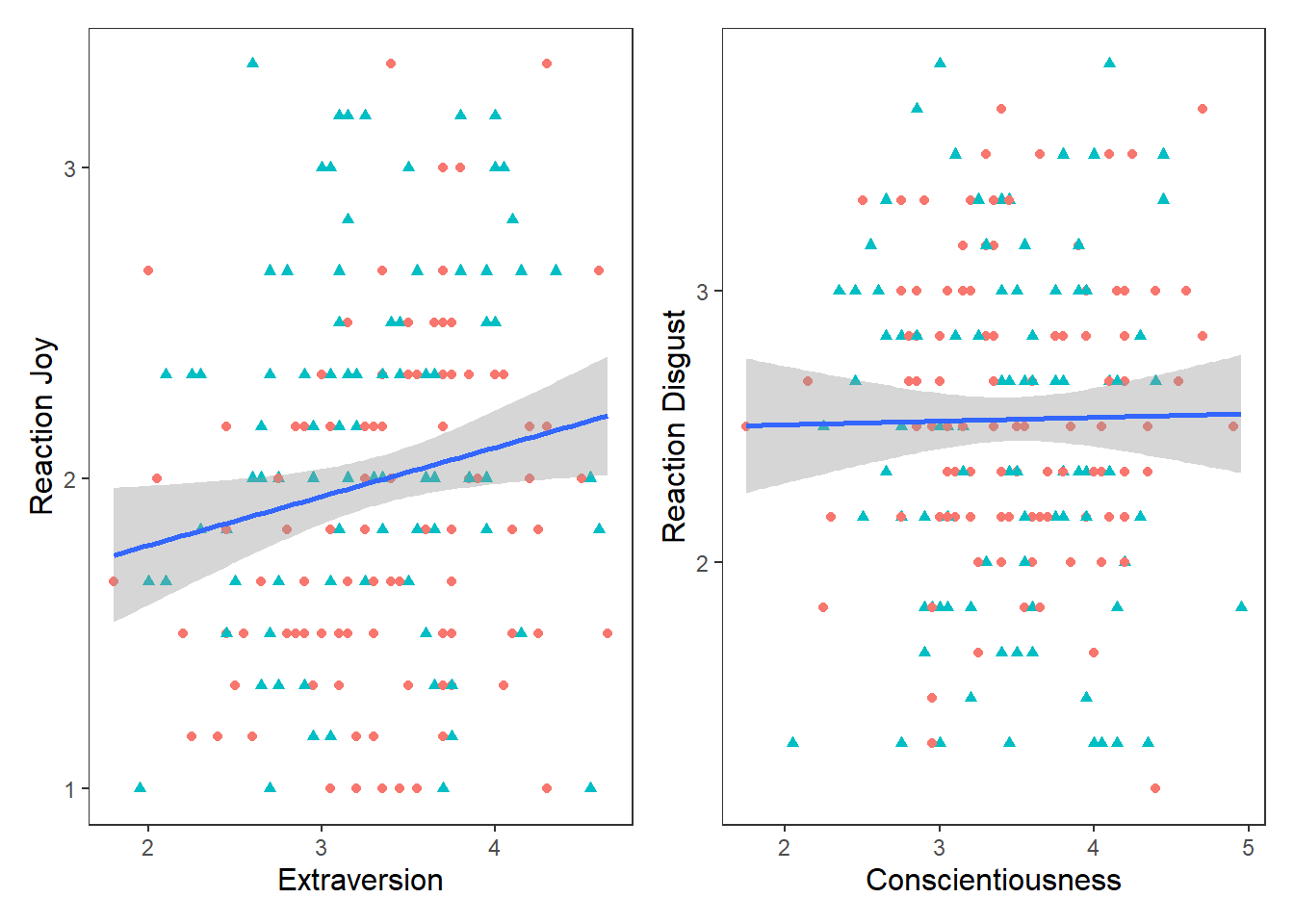
(p1 | p2) / p3`geom_smooth()` using formula = 'y ~ x'
`geom_smooth()` using formula = 'y ~ x'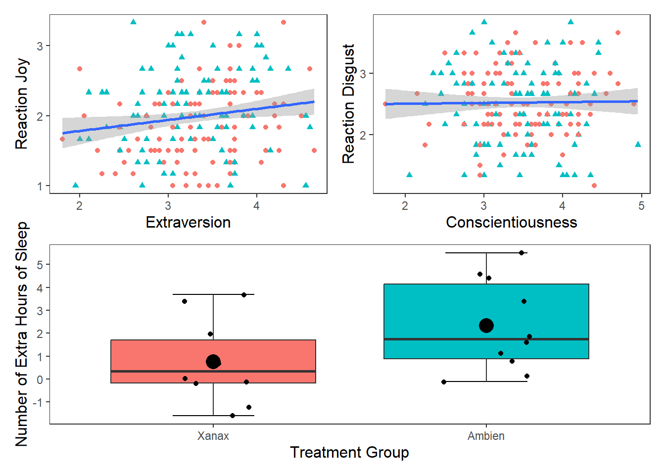
(p1 / p2) | p3`geom_smooth()` using formula = 'y ~ x'
`geom_smooth()` using formula = 'y ~ x'
ggsave("combined.plots.pdf") #saving this configuration to my working directorySaving 7 x 5 in image
`geom_smooth()` using formula = 'y ~ x'
`geom_smooth()` using formula = 'y ~ x'A violin plot is a method to depict the distribution of numeric data across different categories. It combines the features of a box plot and a kernel density plot, offering a more comprehensive view of the data’s distribution. To create a violin plot we use the geom_violin() function. Here is the basic syntax for creating a violin plot.
df_violin <- data.frame(
  category = rep(c("A", "B", "C"), each = 100),
  value = c(rnorm(100), rnorm(100, mean = 1.5), rnorm(100, mean = 2))
)

# Create a violin plot
ggplot(df_violin, aes(x = category, y = value, fill = category)) +
  geom_violin(trim = FALSE,
              show.legend = FALSE,
              alpha = .6) +
  geom_boxplot(width = 0.3,
               show.legend = FALSE,
               alpha = .4) +
  labs(
    x = "Category",
    y = "Value",
    title = "Violin Plot: Distribution of Values by Category"
  ) +
  theme_apa()
Inside the geom_violin function, we specified three arguments: trim, show.legend, and alpha. If the trim argument is TRUE, then the tails of the violin plot are trimmed to match the exact range of the data. If the trim argument is FALSE, it will extend slightly past the range.
Trim - If the trim argument is TRUE (this is the default option), then the tails of the violin plot are trimmed to match the exact range of the data. If the trim argument is FALSE, it will extend slightly past the range.
Show.legend - If set to TRUE (this is the default option, then a legend will appear with the graph)
Alpha - This determines the strength of the colour, higher scores mean the violin plot will appear darker in colour.
These arguments are all stylistic choice that you can play around with when creating your own plots.
Let’s do this with the df_personality data frame. We will put Gender on the x-axis and Agreeableness on the y-axis
You may notice the above plot involves contrasting green and red, which can be difficult for individuals with certain types of colour-blindness. We can also specify options to make sure our plots are more inclusive in their colours, as below:
ggplot(df_violin, aes(x = category, y = value, fill = category)) +
  geom_violin(trim = FALSE,
              show.legend = FALSE,
              alpha = .6) +
  geom_boxplot(width = 0.3,
               show.legend = FALSE,
               alpha = .4) +
  labs(
    x = "Category",
    y = "Value",
    title = "Violin Plot: Distribution of Values by Category"
  ) +
  theme_apa() +
  scale_fill_viridis_d(option = "C")
The scale_fill_viridis_d() function uses colour palettes that are distinctive enough to those who suffer from colour-blind issues. There are several options in this function (A to E), feel free to change it and see which ones you like.
Create violin plots using the df_personality data plotting:
Enthusiasm across Gender
Openness across Gender
Combine these into one figure that enables the reader to easily view and compare these graphs (note there are numerous ways to do this)
F1 <- ggplot(df_personality, aes(x = Gender, y = Enthusiasm, fill = Gender)) +
  geom_violin(trim = FALSE,
              show.legend = FALSE,
              alpha = .6) +
  geom_boxplot(width = 0.3,
               show.legend = FALSE,
               alpha = .4) +
  labs(
    x = "Gender",
    y = "Enthusiasm",
    title = "Distribution of Enthusiasm & Openness by Gender"
  ) +
  theme_apa() +
  scale_fill_viridis_d(option = "C")

F2 <- ggplot(df_personality, aes(x = Gender, y = Openness, fill = Gender)) +
  geom_violin(trim = FALSE,
              show.legend = FALSE,
              alpha = .6) +
  geom_boxplot(width = 0.3,
               show.legend = FALSE,
               alpha = .4) +
  labs(
    x = "Gender",
    y = "Openness"
  ) +
  theme_apa() +
  scale_fill_viridis_d(option = "C")

F1 + F2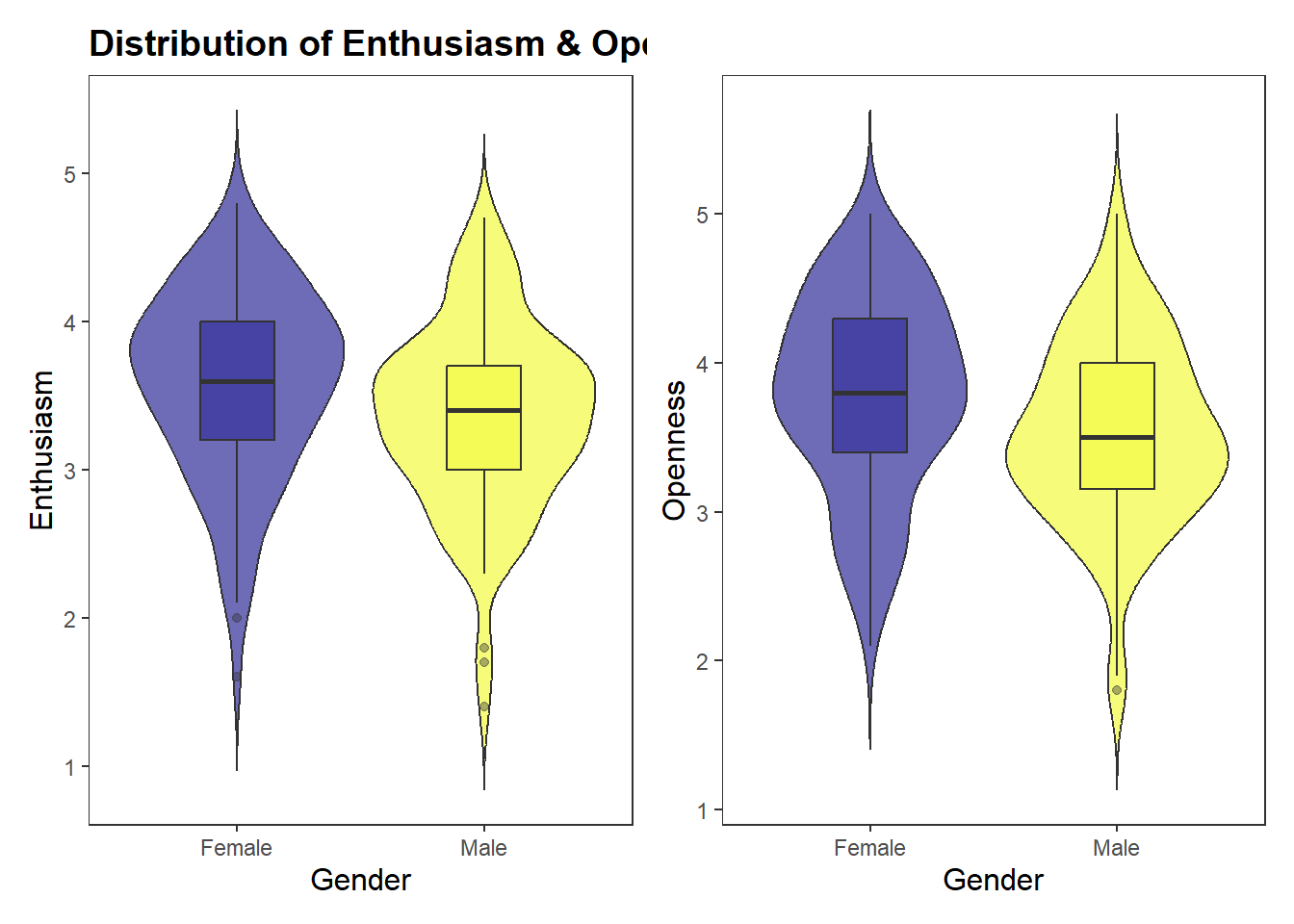
Histograms are a type of bar plot that displays the distribution of a continuous variable. They partition the data into bins or intervals along the x-axis and then use the height of the bars to represent the frequency or density of observations within each bin.
Creating a histogram in ggplot2 is straightforward. We use the geom_histogram() function and map a continuous variable to the x-axis. Here’s the syntax:
ggplot(dataframe, aes(x = variable)) +
  geom_histogram()+
  theme_apa()
We can change the bin width by specify it in the geom_histogram() function. Often you might need to play around with this to get the value you want, you can also use the colour argument to make the distinction between bins clearer.
Create a histogram of age in the df_personality data
Change the bin-width and colour options until it looks clearest
Add an appropriate title
ggplot(df_personality, aes(x = Age)) +
  geom_histogram(binwidth = 2,
                 colour = "white")+
  theme_apa()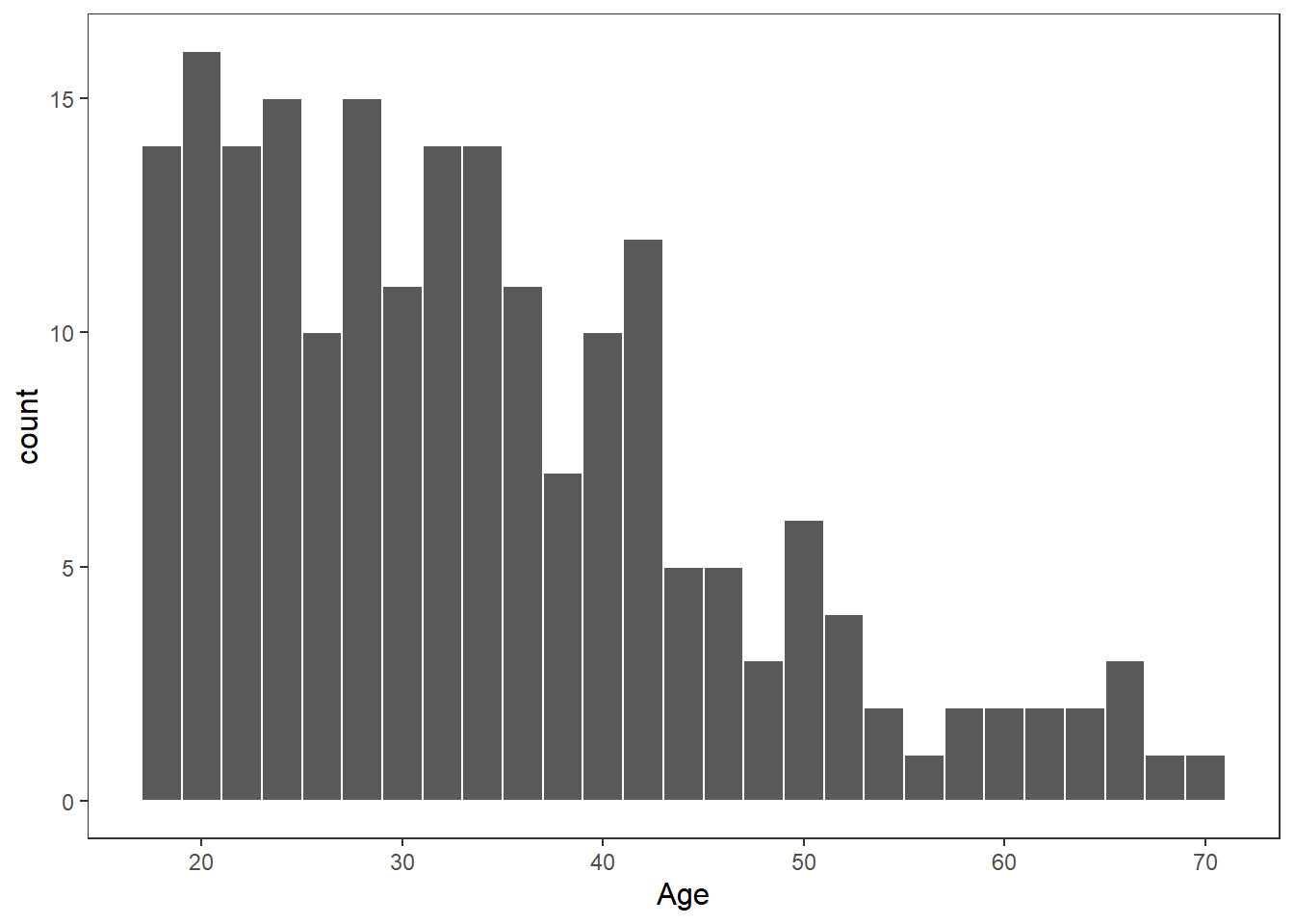
Have a look at the R Graph Gallery (here) and see what other types of graphs you could create.
Using either df_personality or some of the inbuilt datasets in R try to recreate some of the other graph types
Explore other ways to add to or improve the above graphs
Combine multiple graphs into a figure.
Think about what type of visualization will work best for your dissertation data? How can you replicate what is typical in your field using R?